

Let’s get out of your way, here’s the full-resolution map:

Barcelona Equidistant Azimuthal.
Available in my zazzle.es shop.
Now that you’ve seen it and ordered a print :-P, I can start going on on the full process 🙂
How Come?
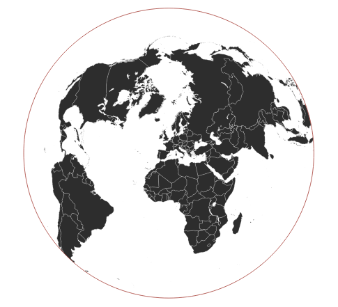
The other day while perusing the flattening the earth book, I came across a two-point equidistant projection giving correct distances from a single center point to any point in the map.
I’ve seen those projections in the past, but I’ve never dabbled in one. So I decided it would be fun to create a visualization of an azimuthal projection centered where I live (Barcelona).
It took me quite some time to have the map finished, and at the end it looked so nice that I even printed it out for me to hang at home.
Custom projections
There is something I’ve barely used in the past in Qgis, and that is the capability to create your own custom projection.
For this case I simply used the aeqd projection azimuthal equidistant as a base, and set the projection center to +lat_0=41.30 +lon_0=2.16 which represents a point in Barcelona.
The full proj4 string is as follows:
+proj=aeqd.
+lat_0=41.30
+lon_0=2.16
+x_0=0
+y_0=0
+ellps=WGS84
+units=m
+no_defs
With natural earth datasets of graticule and continents, the projection looks like the following image in Qgis:

Clipping
As seen on the projection preview there’s a big gap with water covering most of the outer parts. For the map I want to create (distances from Barcelona) I’ll take some liberties and limit it to places closer than 12000 Kms. This will exclude for example New Zealand (as you can see, it appears as a big stretched area on the right) and Australia.

Since the projection is in meters, it’s easy to create the Buffer representing the area that we’ll cover. What does not seem to be so easy is to perform a simple clip of those features. Whenever I try to clip anything I get a nice GEOS geoprocessing error: intersection failed. This is because the natural earth data is in EPSG:4326, to clip neatly is important that the layers are stored with the same CRS.
From QGis, when exporting the Layer it’s possible to select the destination CRS. I’ve saved those layers with the custom CRS and the clip worked without problems for the graticule.
Unfortunately I had some trouble clipping the countries data:

Black: countries on clipped layer,
grey: countries pre-clipping
The clip tool from Qgis refused to work, clipping directly from GDAL was another story, but it left out Russia since it found an invalid geometry.
To solve this, I just copied over from the original layer to the new layer (Edit->copy feature, Edit->paste feature)
And to solve the part about the Invalid Feature there’s a strange trick using GRASS. I perform a buffer of 0 degrees from the data and the feature ends up fixed :-).
Cities
There’s almost 0 interest in this map without some cities sprinkled where we can actually measure:
-

- All cities pre-clip

-

- All cities clipped

-

- A close up on labels in Europe

The process is exactly the same. Get the cities data from natural earth, convert to our own projection, and clip whatever is outside the limits.
Next step is actually selecting which cities to use. The dataset contains far too many cities to be represented in the final map (I’m aiming for 1:60000000 scale on a paper sized 40,64 cm x 50,8 cm).
I filtered by "SCALERANK" IN ('0','1','2'). Which I just decided by simple inspection of the full map. Adding the level 3 forces the map to a very small font in busy map parts, which is difficult to read (but not impossible).

With all the cities filtered. The question remains to have all of them with the same type of representation or add some extra information. With the POP_MAX attribute it’s easy to size the circles depending on the city population. Moscow at ~12million residents is much bigger than say Oslo at ~600k, and this can be represented nicely on the map.
Second step is the labels, I used Frugiter as a font which is plain and readable at that small size (2mm).
Font-wise the distinction is between capitals and non-capitals. For the capitals it’s a 2mm full-black font, while the non-capitals are reduced to a 1,75mm with greyish colour.

Label positioning is mostly handled by Qgis. But a lot of manual adjustments need to be performed. Luckily within Qgis we can use the manual-position labelling for the labels that need it. I’ve spent a humongous amount of time just reviewing the map labels to adjust them in proper positions. And when some random label position changes, the rest of your manually positioned labels can apparently move, which is simply a rage inducing.
Adjusting the labels is always painful, so it’s always the last step 🙂
And now that we’re at the end of the label part, I can share a secret, the final filter used is much more convoluted:
("SCALERANK"  IN ('0','1','2')) OR
(("SCALERANK" = 3) AND
    "ADM0_A3" NOT IN
	('DEU', 'AUT', 'POL', 'UKR', 'ALB',
	 'KOS', 'SRB', 'HRV', 'MNE', 'BIH', 'CHE',
	 'CHN', 'JPN', 'IND', 'EGY', 'USA',
	 'MEX', 'DOM', 'KOR', 'PRK'))
AND
"fid" NOT IN (315, 314, 309, 277, 320, 128, 437, 1064, 831)
I added the rank 3 labels because some areas were very empty (Russia, South America in general, Africa..), but there was no way to add more labels in Europe, so that’s why rank 3 labels are filtered by country.
Also, some specific cities were annoying because they were so close to other existing big cities, those features are filtered out.
Buffer circles
The buffers are very easy to perform, by using Qgis batch processing, we can set different buffer sizes on each step. Since the projection is in meters the buffer size it’s plain obvious, and since the projection is equidistant from the center point, the buffer result is a nice circle.

Batch processing buffers
Buffering returns polygons which is not what I need, another step Polygons to Lines fixes this by transforming everything into a line. This again can be performed with batch processing.
For each created line, I had to set a proper label attribute with the proper value (1000, 2000km etc..). This is a matter of editing the Layer and manually adding the labels. Yes, this was one of those times where I was thinking if it was worth to automate this with python, but I simply powered through.
Now, to have labels in two or more sides of the circles I’ve splitted the buffer-lines in various features, cutting by a line:

Example cut line
This example image is not the cut line that I’ve used, but you get the idea. Once the lines are split I can position the labels however I want. Originally I let Qgis select the label position, but the outer rings were never centered respectively to the inner rings, so at the end everything has been positioned and rotated manually.
Protractor
One of the end-touches that I wanted for this map was a full Protractor (which incidently I just discovered is called this way). I was astonished how difficult this was! it’s just a roulette with angles.
I ended up doing it as a post-processing purely graphical step, once the map was already finished and exported to a high resolution image, GIMP stepped up to save the day.
Not simply GIMP, but the script found in a chat that creates a protractor path in GIMP. From that path I could use the stroke path tool and painstakingly add text layers with the different angles.
I’m sure there has to be an easier way to do so.
Closing
It took me roughly a month on and off to finish this map, and I believe that most of the time has been spent dealing with the labels, the protractor and the final touches. So yes, one of those small projects that take a lot even if there’s nothing inherently difficult with it.
I have to say, it’s been extremely fun doing so 🙂 A good way to disassociate my mind from other non-working software that I had to fix 😛

At home 🙂
