

A couple of Barcelona neighbourhood mean renting prices maps I’ve made today simply because…. no reason at all. I’m not performing any analysis of the provided data, just a picture 😛

Both are the same representation with data from 2014 and 2018, a choropleth map from cheap to expensive. Over those 4 years the cheap/expensive places are mostly the same although it seems that the price difference has widened.
Some areas had no data (depicted in grey). And also note that the two maps are not directly comparable to each other since the depicted legend ranges are different, rent prices have gone up in all neighbourhoods.
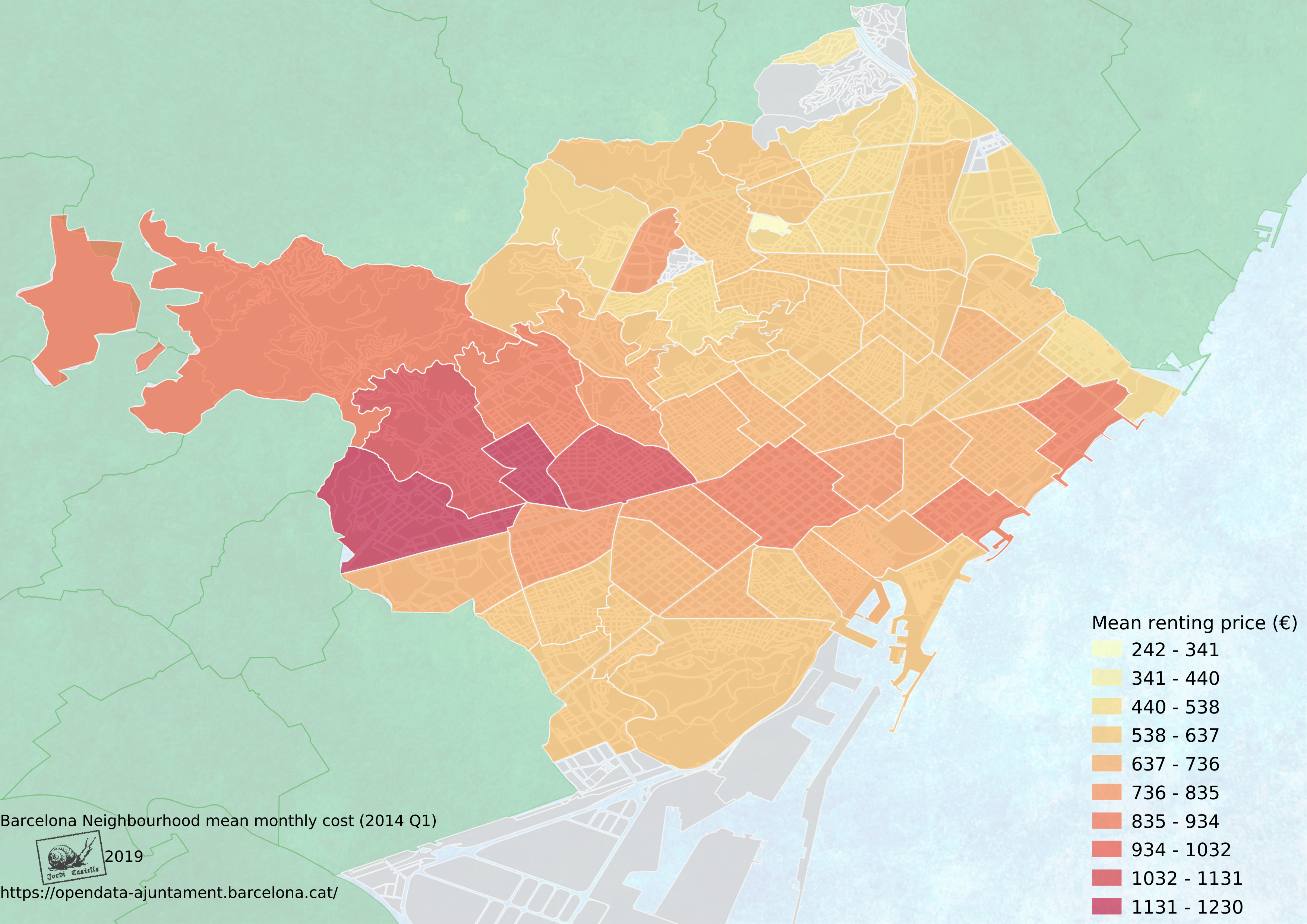
I have nitpicks with the legend, and the base datasets of neighbourhoods and city limits do not perfectly match (some artefacts are present on the city boundaries that I did not bother to fix).
As an extra, here’s a quick reference with the names of each neighbourhood. (I let Qgis select the label placement 🙂 some are somewhat strangely placed).

Comments
Always be critical with graphical data 🙂 For this post I haven’t deeply analysed the data: Barcelona mean rent price, and even let QGis choose its own class distribution :-P.

Pingback: Barcelona traffic accidents 2018 | Castells
Pingback: Barcelona trees | Castells
Pingback: Barcelona unemployment evolution 2012-2019 | Castells